Teach ~ Inspire ~ Play
At Sephora, our department are upheld to the highest standards when it comes to learning and development. Our mantra is after all, to teach, inspire & play.
When Sephora began to expand their store locations, new employees needed a way to learn and develop skills related to their job via the My Sephora Learning platform.
I worked closely with the Senior Education Manager to strategize and define our internal processes and design workflow.
Problem
The existing e-learning courses were difficult to navigate and understand.
Designs were developed with inconsistent branding, interface, and did not hold into account the time to completion.
Beauty Advisors/Employees were looking for more interactivity, and gamification.
The department sought to migrate the learning platform
Goals
The goal was to build a consistent interface.
Utilize interactions to delight employees with fun, active learning.
Improve the user experiece through the platform migration
DESIGN SYSTEM
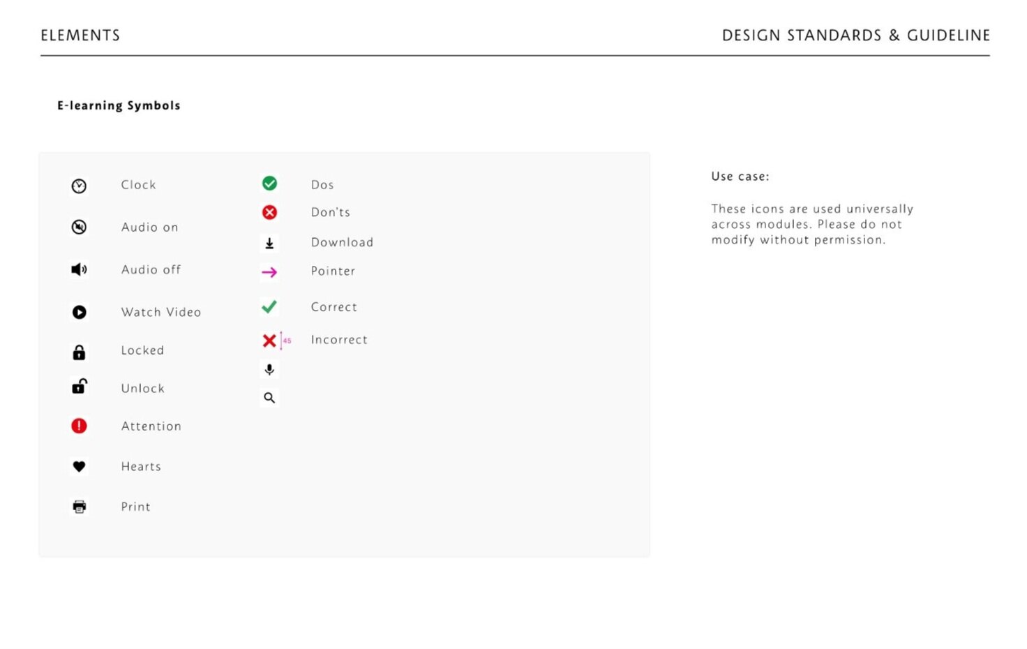
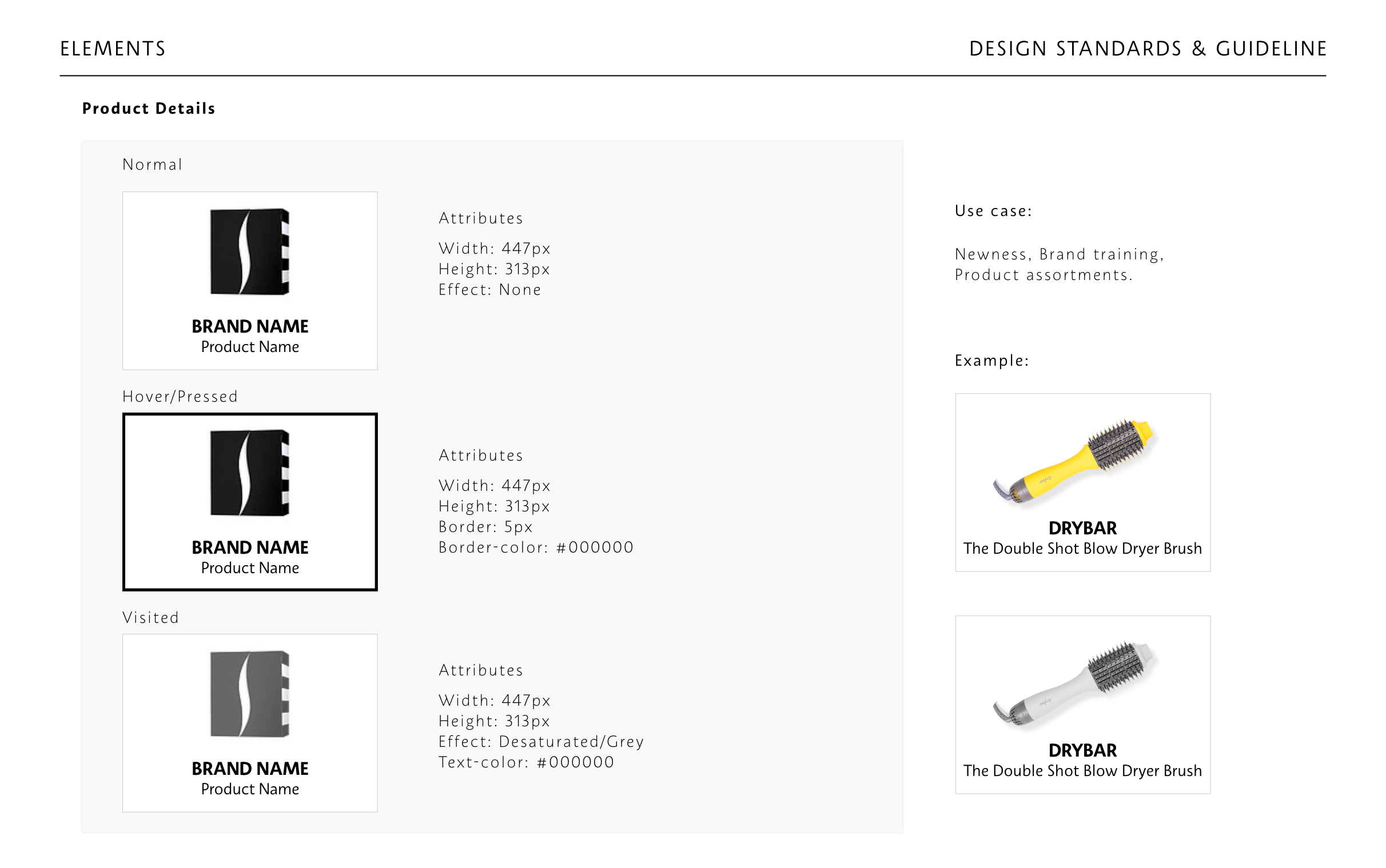
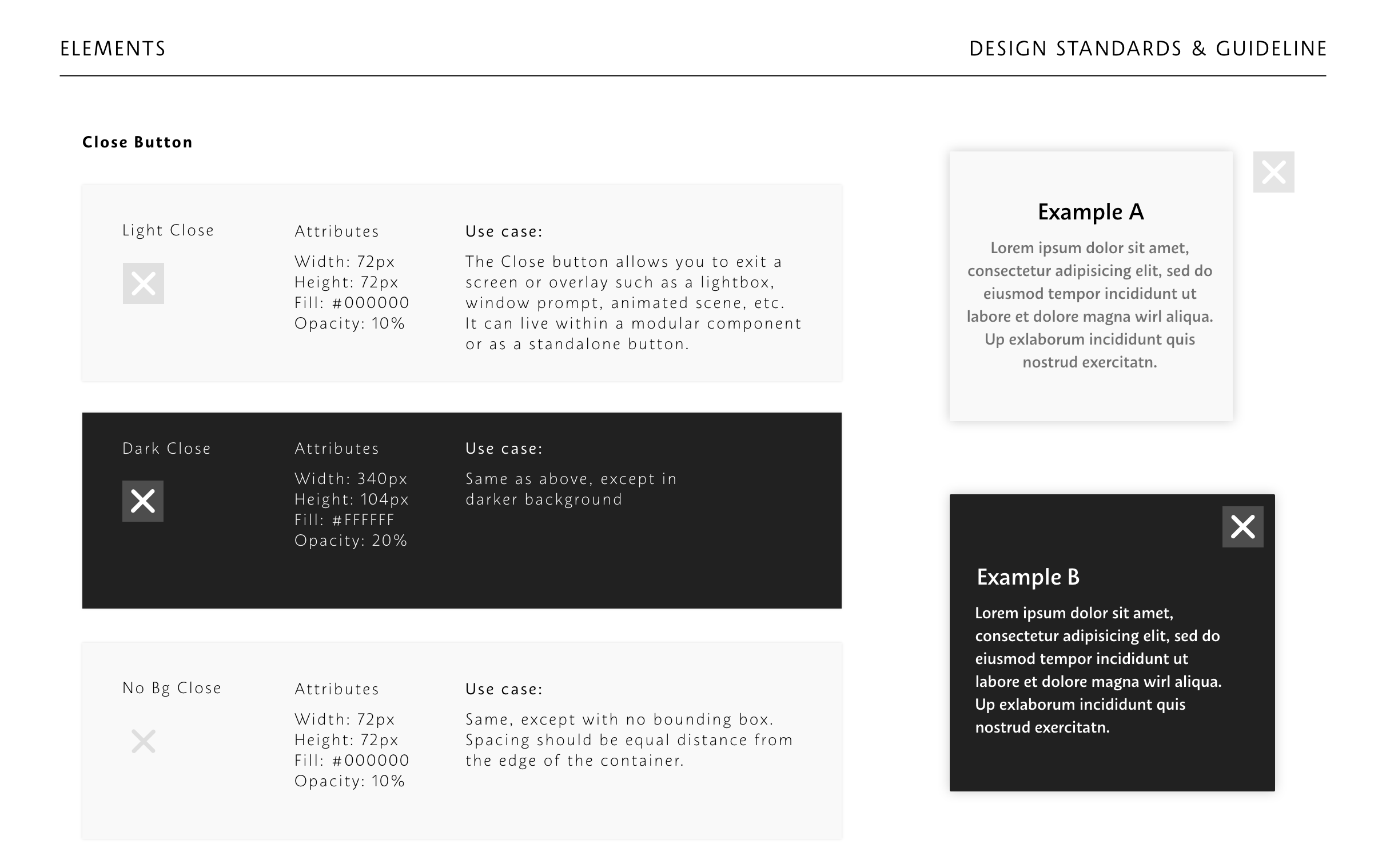
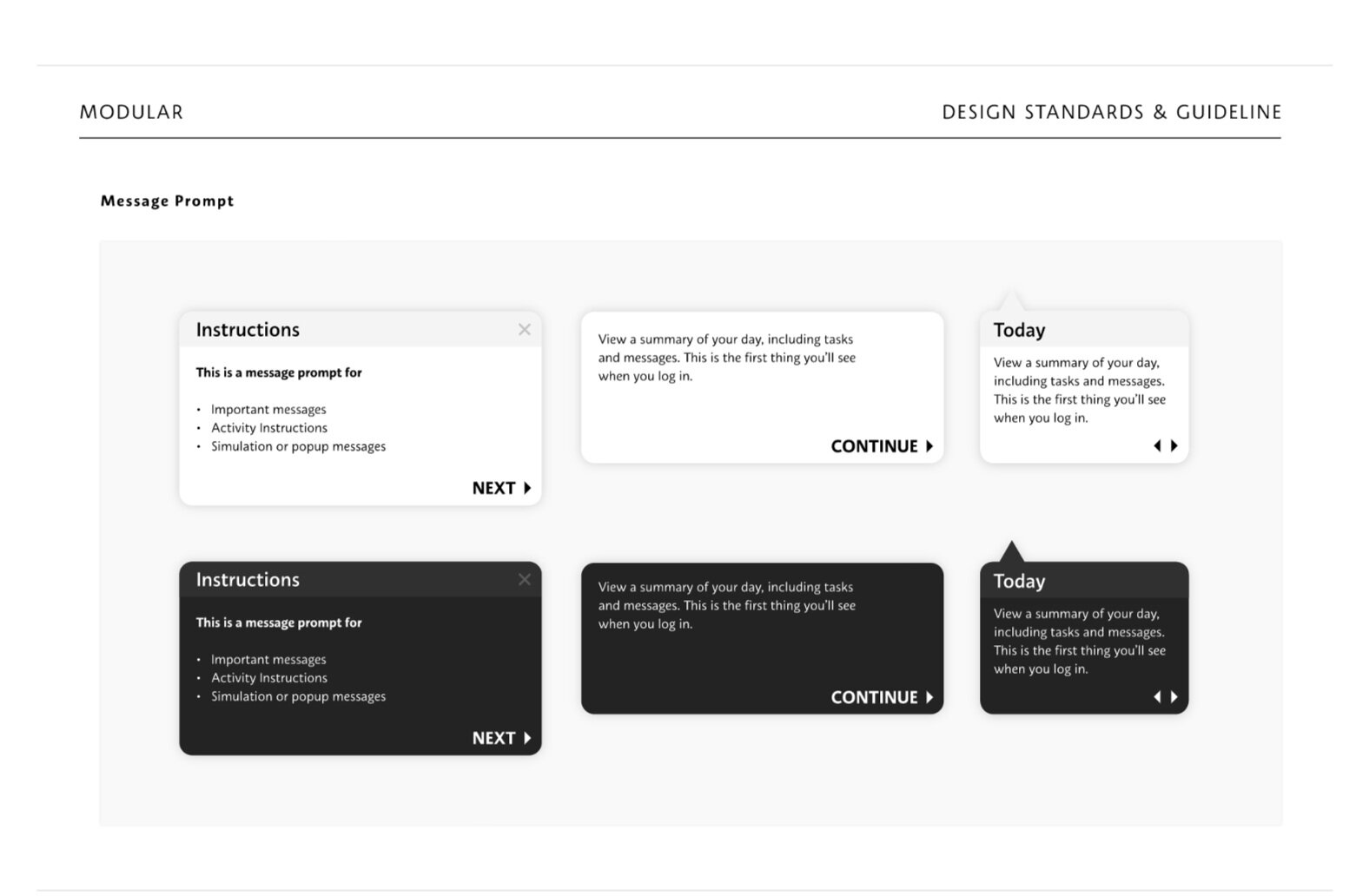
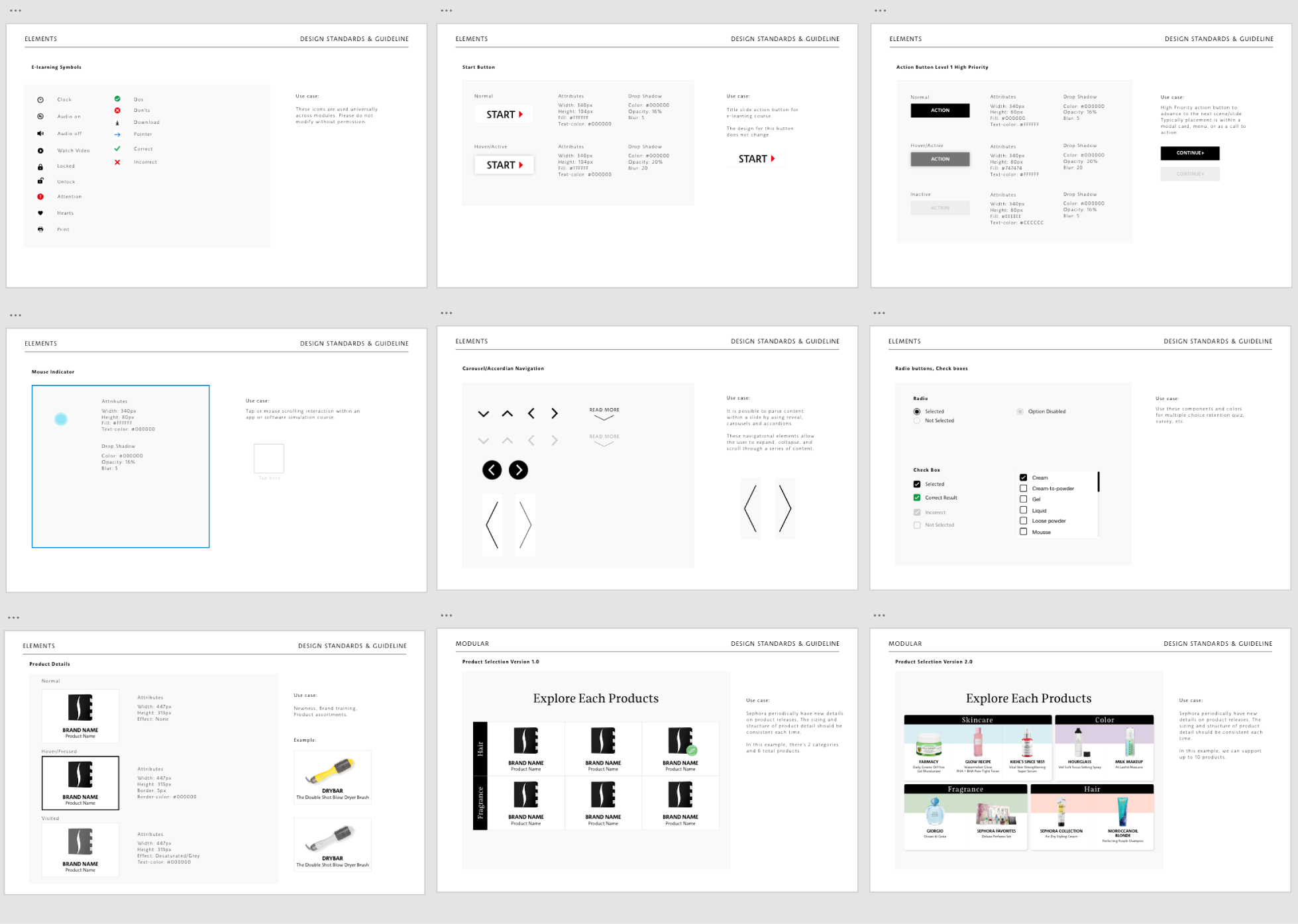
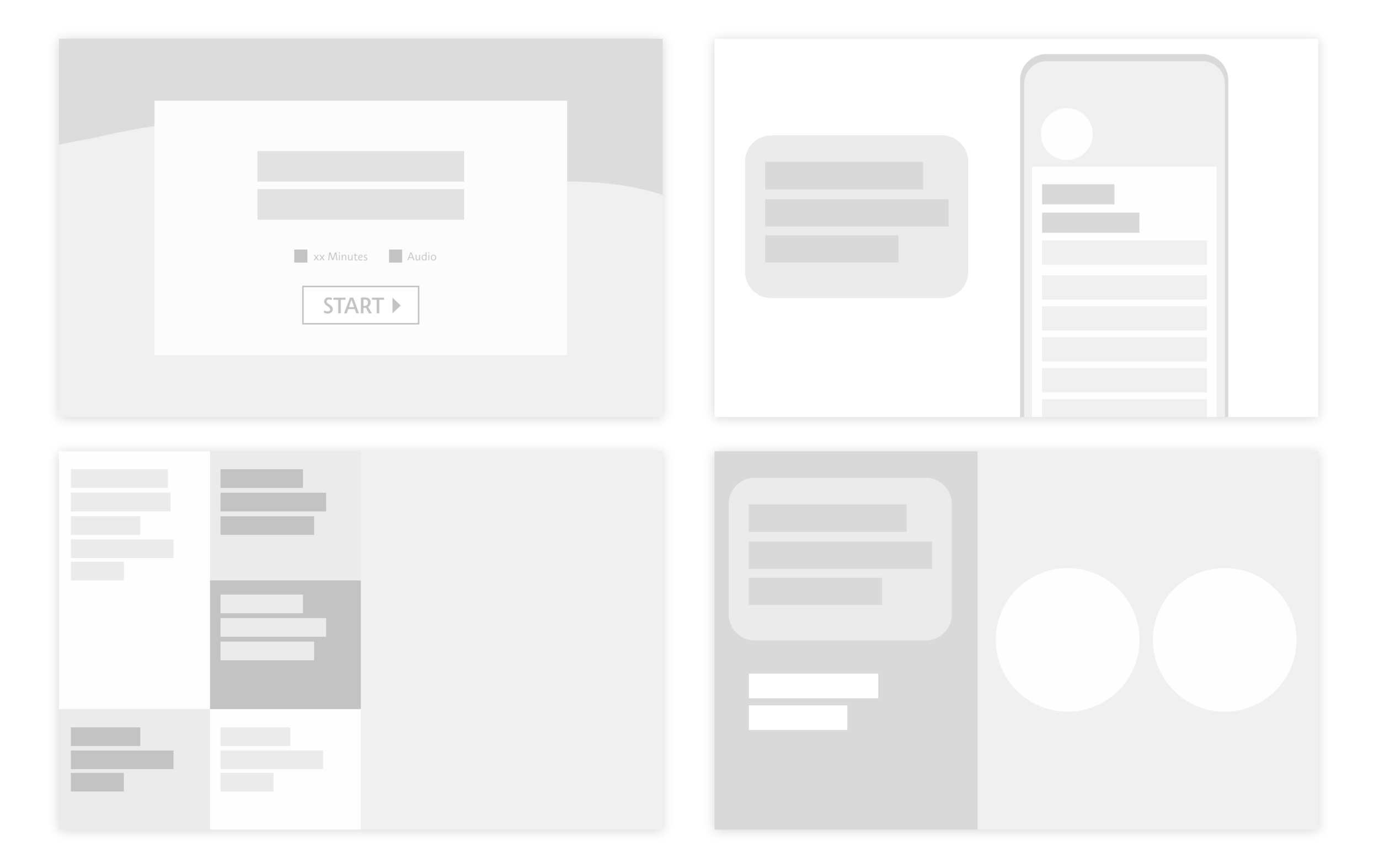
One of the biggest challenge was to help reshape our design system— which in truth did not exist. Our subject matter experts typically reused existing assets from previous documents that became outdated and inconsistent with Sephora’s branding. Our interactive learning courses consisted of random shape, size, typefaces and component states and caused obvious frustration for our users Collaborating with the copywriter, we also discovered content were often too lengthy for the average users to complete efficiently while in-store. We explored the development of an internal design system and created a new standard that included the documentation of design components, layouts, and usage. Link
GAMIFICATION
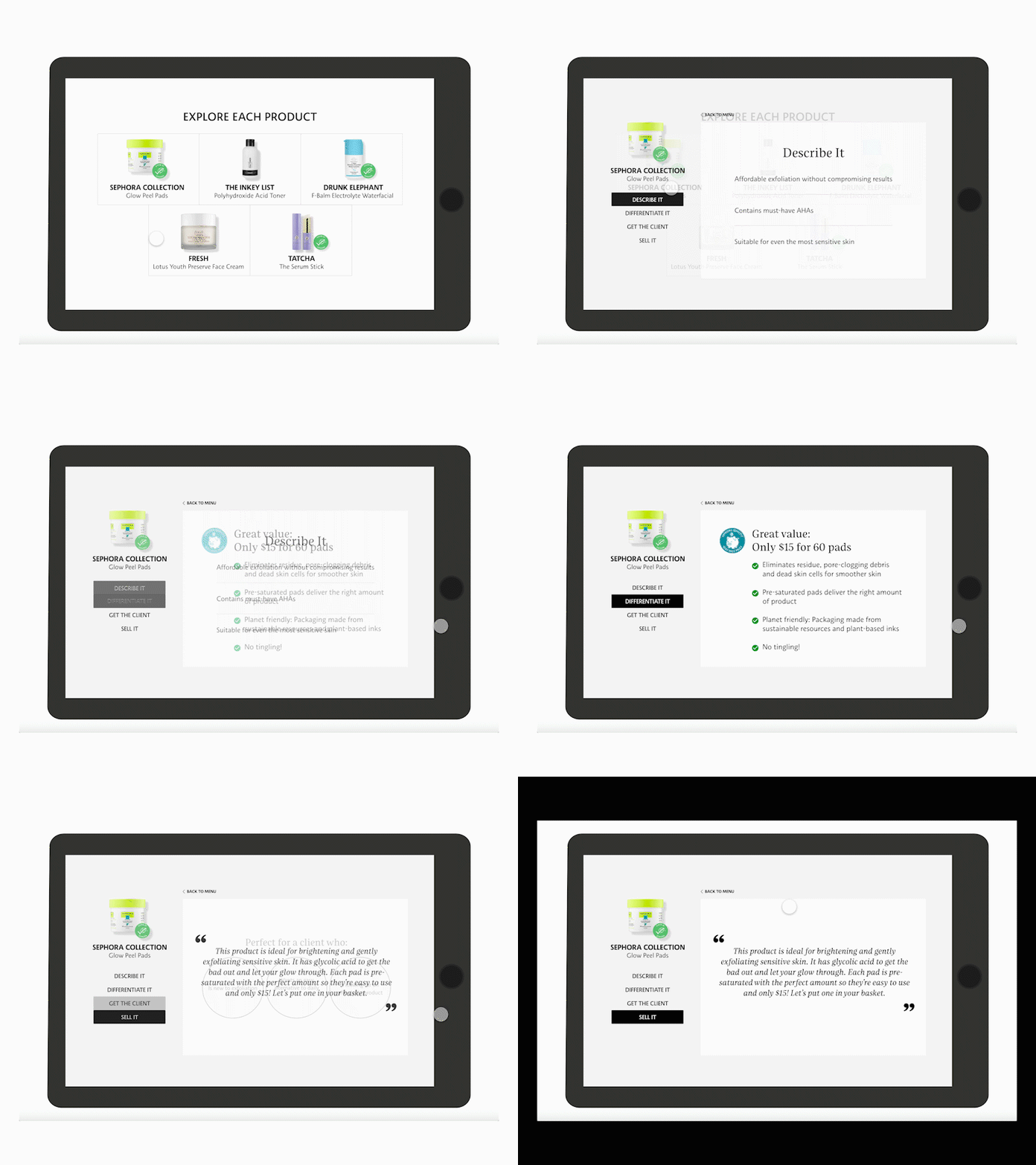
The goal of gamification was to make the experience of learning fun, and increase the quality of training our employees needed to obtain foundational skills in servicing, selling, and dealing with clients. Using a blend of storytelling, introduction to challenging scenarios and interactive UI, we improved the overall learning success of thousands of employees across North America.
Examples of Interactive learning:SYSTEM MIGRATION ROADMAPPING
The Education org decided to migrate the software to a new product, and our team was asked to evaluate the UX and ensure that migrated content did not result in platform downtime or errors. We began conducting user testing to find and solve for all edge cases.
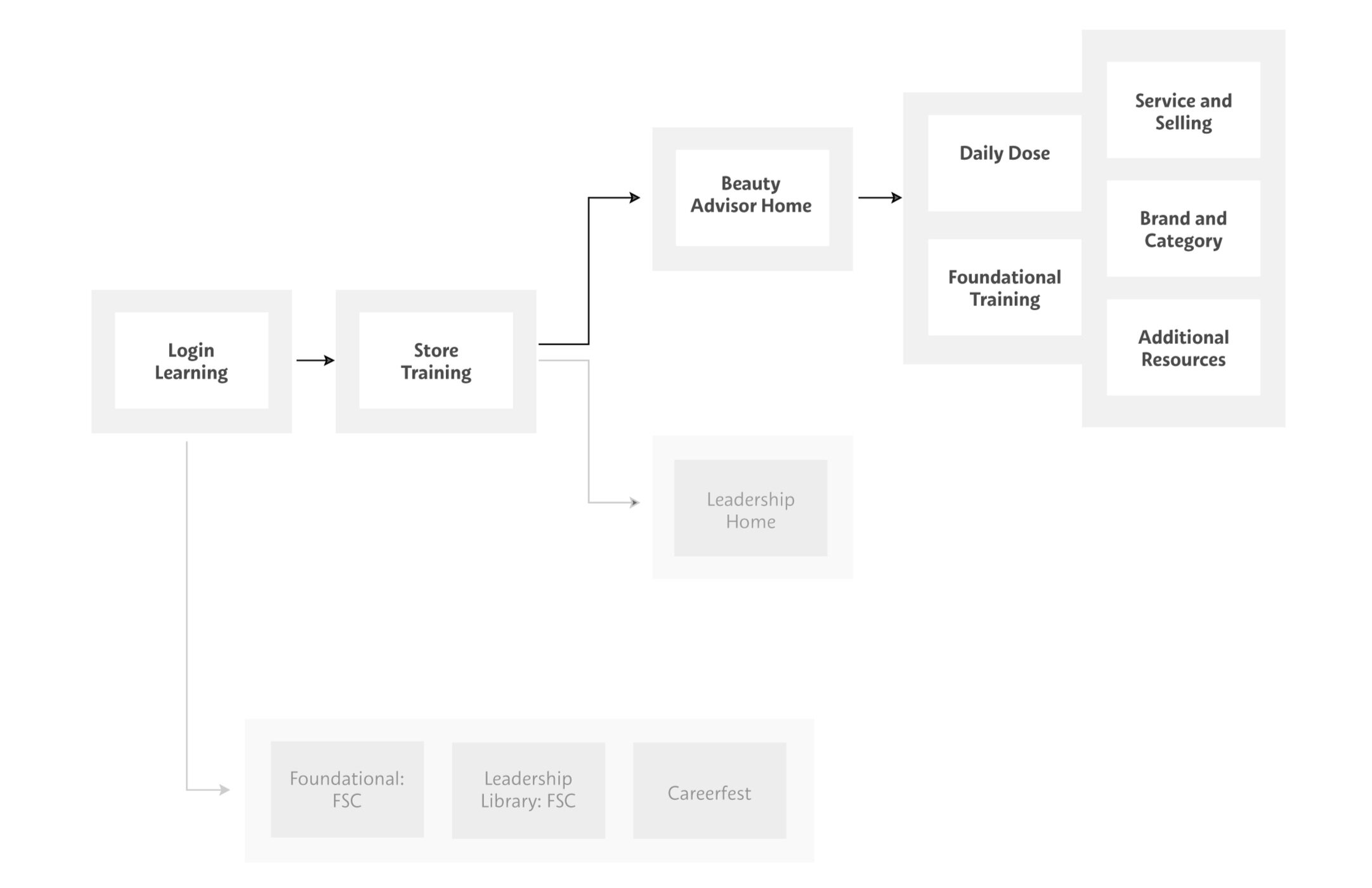
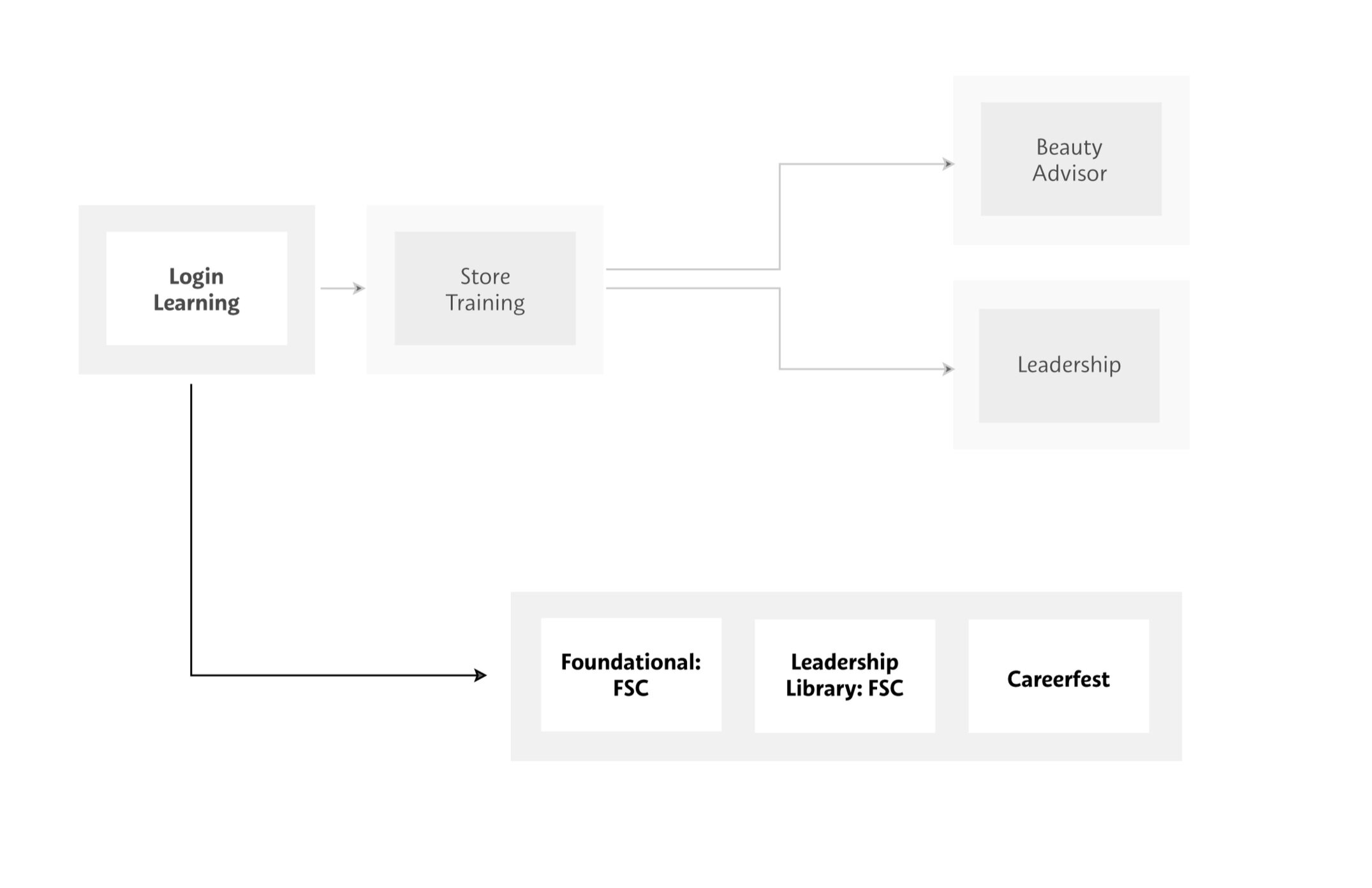
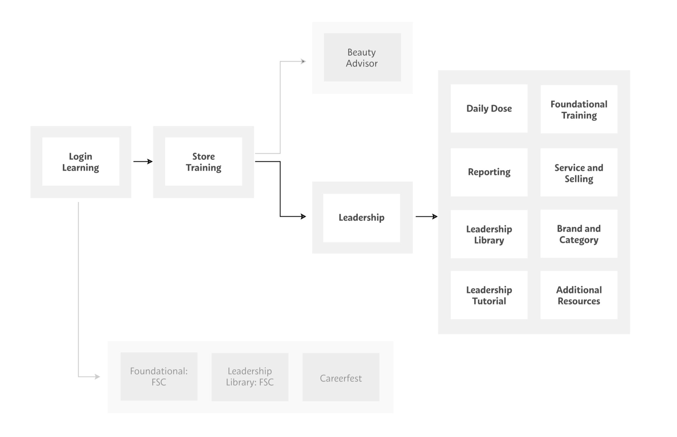
user journey and FLOW
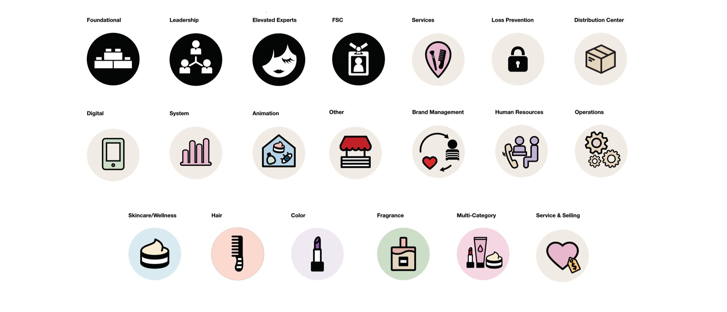
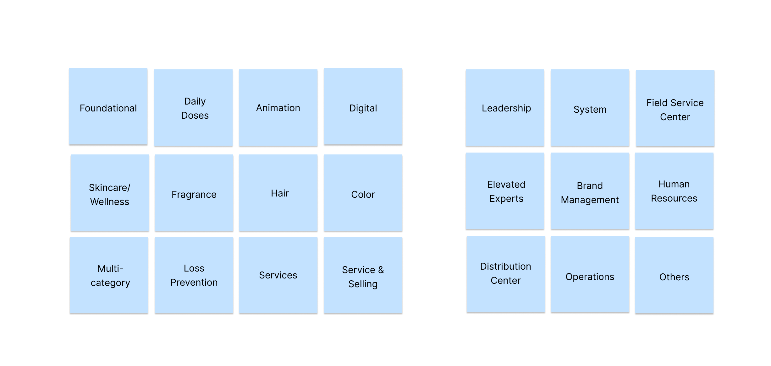
We interviewed the subject matter experts, and worked closely with them to organize our system categories depending on the roles of the users (employees, managers, admin), and grouped them in order of priority for the in-store team. These categories were then updated on our learning management system.
Responsive and Mobile experience
RESULTS
We successfully launched gamification, MSL 2.0, and defined new design processes, going above and beyond organizational expectations.
We improved internal workflow efficiency between development and design by +10%.
Refined workflow, Service Level Agreements and created new processes for documentation.
The learning experience improved YoY and reached an overall satisfaction ratings of 4.5/5 across all training categories.
We surveyed our USERS, and received overall ratings of 4.5/5 with over 20,000 completions every week.


