Lower the Barrier to Learning UI/UX
Background
As part of Camp Figma inaugural design challenge, I participated in the hackathon with 2 other designers. Our objective was to create a resource for designers to learn and build empathy for design.
My Role
UX/UI Designer
Responsibilities
Survey/Research, Affinity Map, Wireframes, Prototype
Duration
36 hours
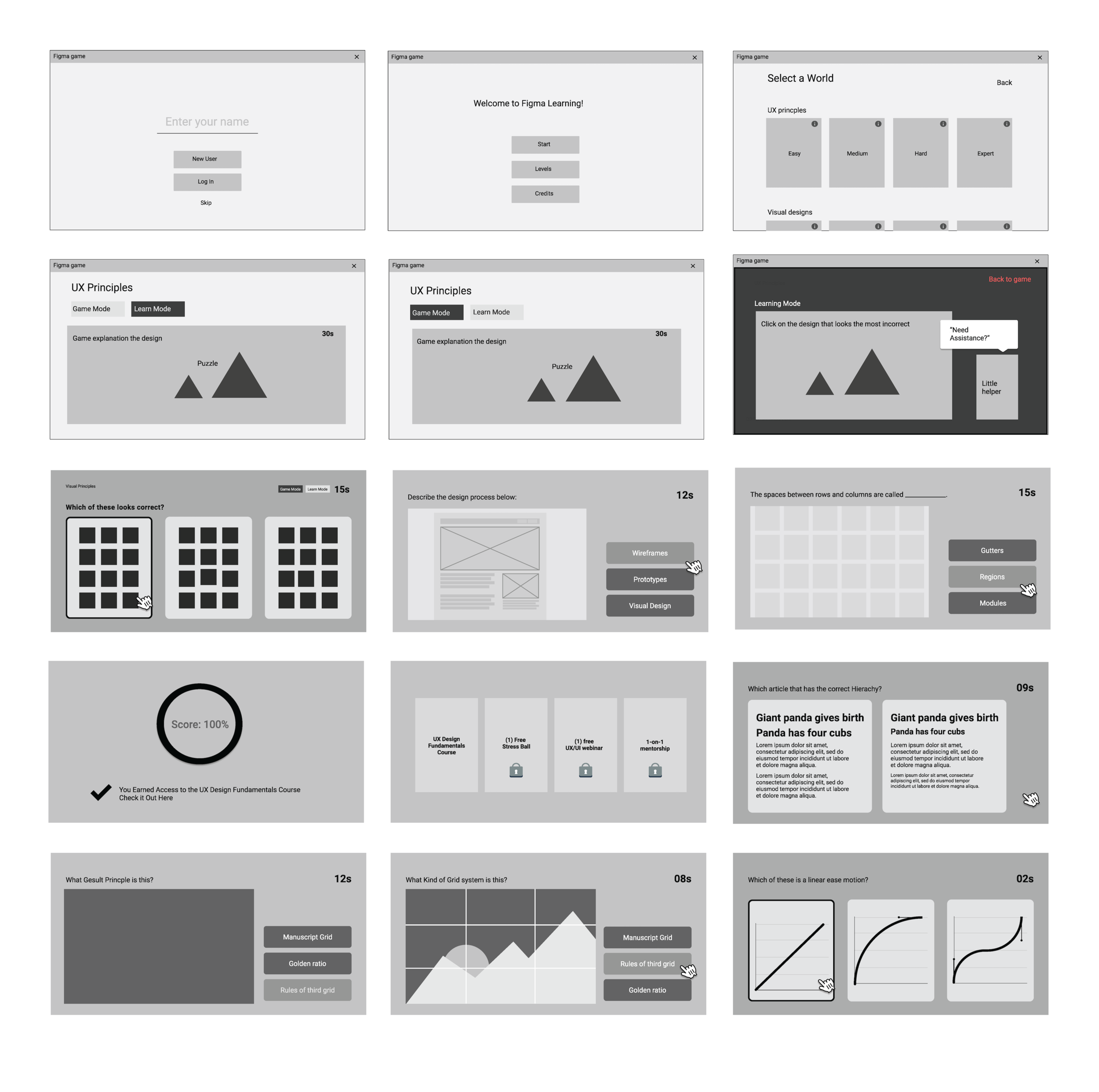
Figfrenzy is an add-on game that consists of various UX and visual design lessons, allowing junior to senior designers to choose the appropriate topics that will sharpen their skills in methodology and design principles.
Users can get instant feedback throughout the game, and dive deeper with additional content in Learn Mode to help guide the users to success. Throughout the stages, the users will collect reward incentives including 1-on-1 mentorship with a professional, or free online courses that will further their career goals.
User Survey
We conducted a survey of aspiring UX and Product designers. Through a design community network we were able to recruit participants.
Our goal for this survey was to better understand the motivation, feelings, and behavior as an aspiring designer.
Our findings:
Students lacked the resources to practice foundational design.
Students did not want to pay for premium courses/lessons
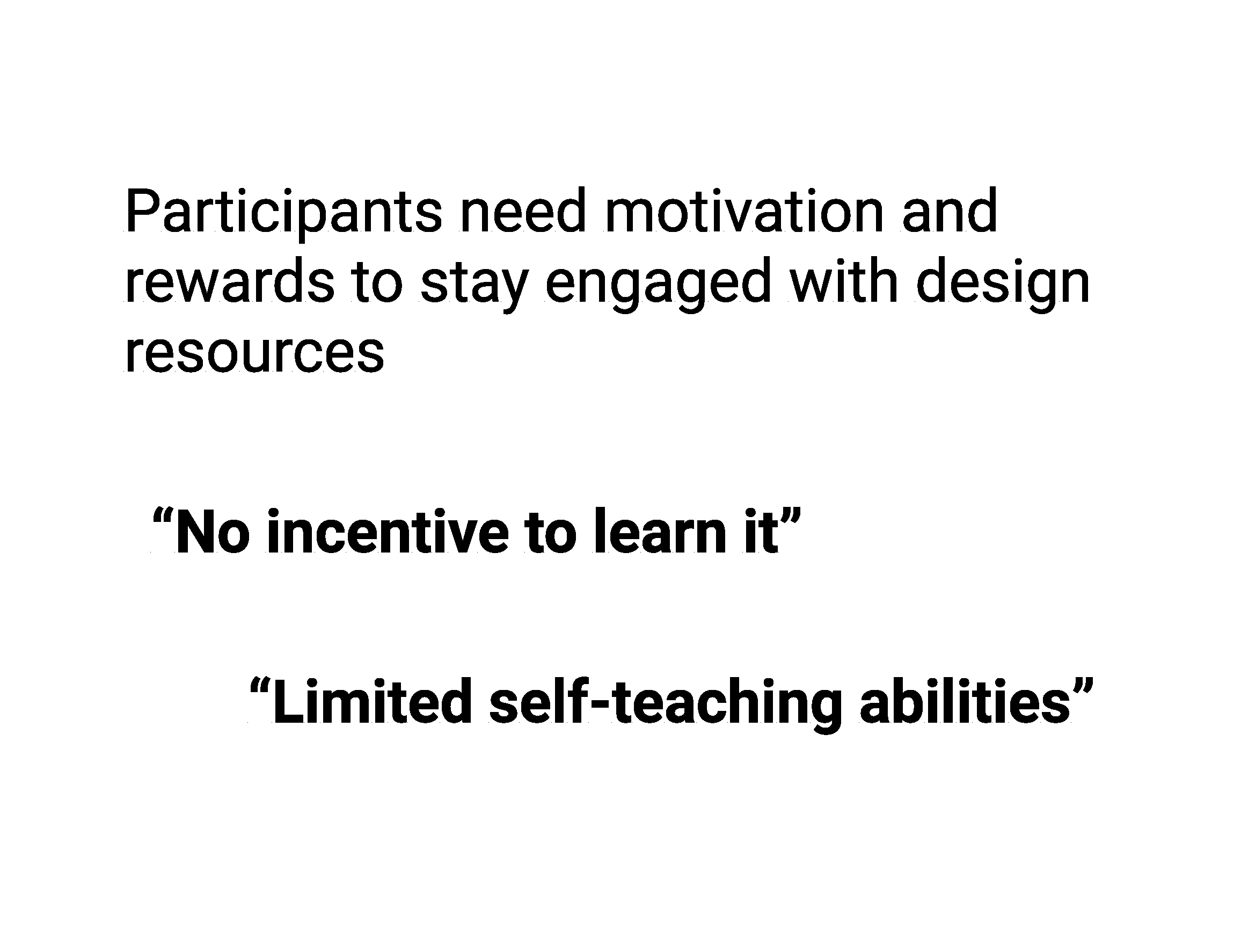
No incentive to learn and limited self-teaching abilities
AFFINITY DIAGRAM
”How can we lower the barriers and warmly
welcome more people to get started with design?”
Visual Moodboard
FigFrenzy was about having fun learning design skills without the burden of long lectures and articles. In our brainstorm, we explored in-app helpers such as clippy from Microsoft Word, and drew inspiration from classic video games, to help define our user interface and characters. Through the user’s lens, we explored different themes, character style, colors, and interfaces.


