Role: Sr. Product Designer
Team: UX Researcher, Product Designer, Visual Designer
Duration: 4 months
Destigmatizing Menopause
Approximately 75% of women experience menopause symptoms and conditions that can lead to a significant reduction in quality of life, increased utilization of medical resources and an overall loss of productivity. (source).
When Naomi Watts discussed her personal challenges and her mission to eliminate the stigma of experiencing menopause, we realized the complexity and importance of the Stripes brand for women. We wanted the platform to bring people together and to start conversations about menopause.
We asked our core audience and found some key challenges with the community.
Our goal was to…
Build a platform for the brand to reach the community and have conversations around menopause
Support the launch through a variety of product offering with an shoppable experience.
Create educational content and resources that users can engage with.
What we discovered
Menopause comes in all different shapes, sizes, and experiences.
Science and education can break the silence and stigma.
Community members are seeking a safe space to discuss and learn about menopause
Taboo topic of conversation, there is little to no investment in research
OUR customers
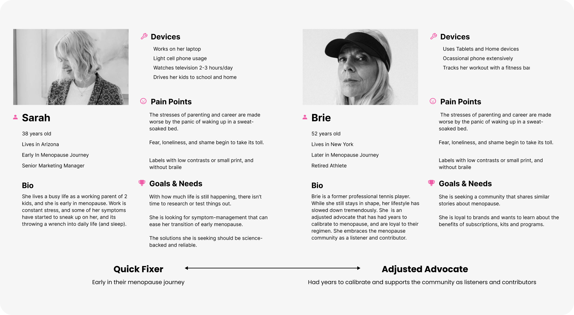
We also identified two core user groups within our target audience. Essentially, there are the Quick Fixers who are early in their menopause journey, and also the Adjusted Advocates that have had years to calibrate and turn to the community as listeners and contributors.
Competitive Analysis
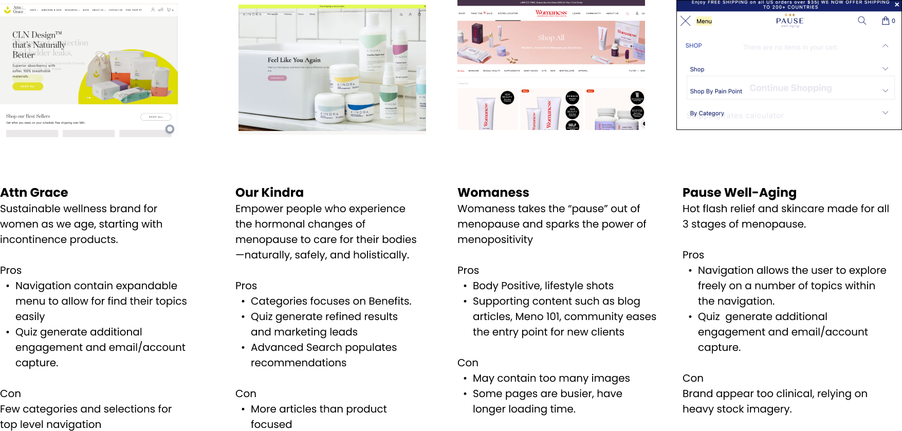
Looking at the competitive market, we analyzed several websites that provided menopause resources. The brands lean to self-education and learning about the concerns and symptoms of menopause. Some of the key resources include quizzing, blog articles, and educational guides, which help drive user engagement and acquisition.
information Architecture
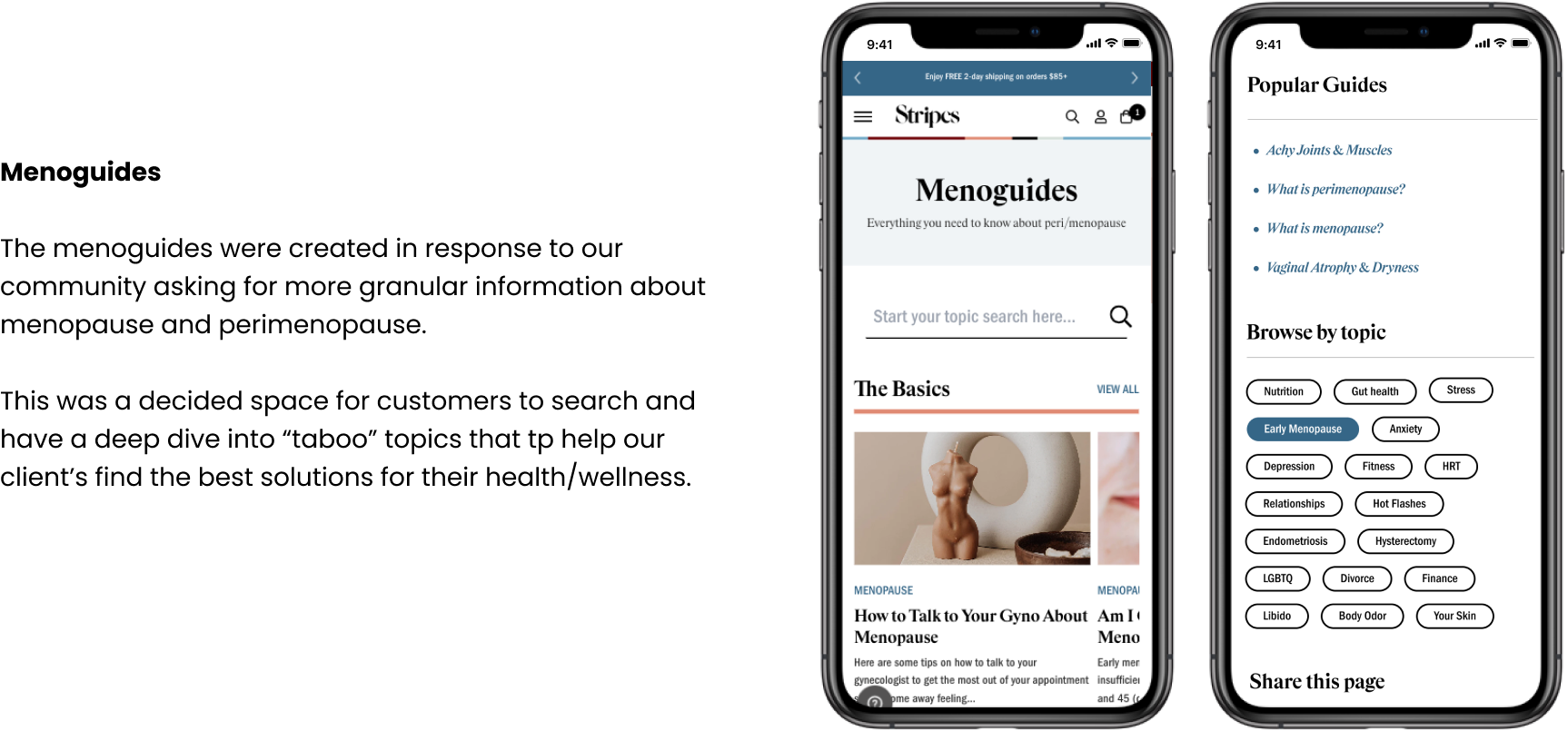
Because the topics of conversations can get overwhelming for menopause, we wanted to refine our navigation and site architecture to simplify and reduce the time spent on searching for information. Through card sorting exercises, we synthesized a list of symptoms and product categories that were most common and placed them into shoppable collections and educational content within the site architecture.
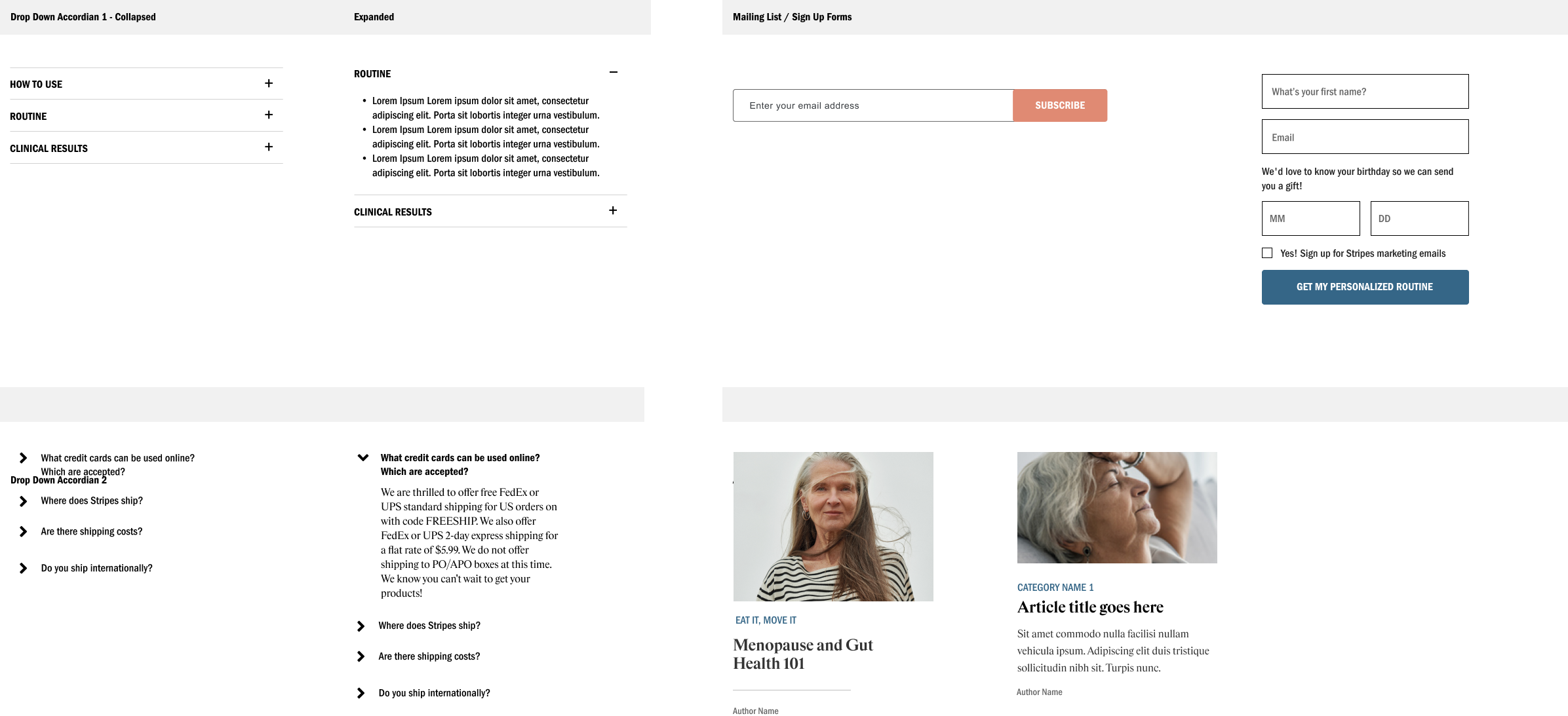
Design System
Qualitative User Testing
We conducted a moderated user test with 15 participants to get initial feedback on the user flow and interactions.
Creating a Discoverable and personalized Client journey
that serves the menopause community.
Takeaway
While our team were aimed for the north star to be able to launch the Stripes brand, there were many challenges that our team had to overcome and could have avoided with better planning and organization.
We must have the perspective from both the users and stakeholders. In testing the site, we learned from our users that it was hard to understand product benefits through the product titles. This impacted the entire navigation and user flow as our internal team did not flag the problem earlier on.
Collaboration will elevate your product. We went through multiple iterations of design with leadership. However, our users alluded to the difficulty of understanding the value proposition and the core benefits. To solidify our brand voice and value proposition, brainstorm and sprint meetings were necessary with the brand team to provide the full story and educational details that aligns with the brand mission.
OUTCOME:
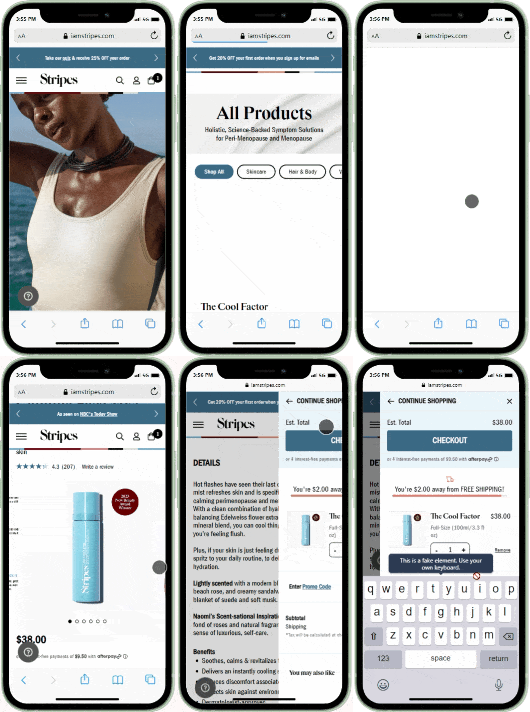
iamstripes.com saw a decrease in bounce by ~13% compared to LY (2022) following updates to Nav, HP, PLP, mCart which validates the success of usability optimization across the site experience.
Avg session time also increased by 5s in December 2022


